Sunday, March 16, 2014

March 16th 2014: Around the world and back in weekly charts. Some scary, some not.

Let's start with a throwback to 2007 - right before the crash...

Here's what the NYSE looked like in 2007:


OK, fast forward to present time (March 16th, 2014) and take a look at the INDU's.  Obviously, there's some major differences between the 2007 $NYA and 2014 $INDU's, but the structure is remarkably similar.  PPO lines show similar negative divergence w/price.  You have a left side "doublet", a swoosh down to the 30w (150d) EMA, recovery and failure.  Although the sequence isn't aligned exactly, it's close.  History doesn't repeat, but it often rhymes.  Significantly, what we don't have yet is the "panicky" volume that came in 2007.  Still worth watching.


So what, you say.  It's only 30 stocks.  It's a statistical sampling error that's revised every few years by a bunch of grumpy old men to make it even less consequential or reliable.  OK, let's look at some other charts from the US and around the world.

How about retail?  That's an important US sector, right?  We're supposedly a retail-based economy.  After a blistering run, I see a series of lower highs here.  Can't argue with price until we see a higher high.


And where's the leadership coming from now?  Utilities.  Ugh.  I'd rather staples and low-vol lead, than utes.  Anything but the 'utes.


It's not all bad.  US small caps are making higher highs with volume.  That's bullish.  Price is still above the 10w EMA.  Elder bars are green.  There's still that pesky, omnipresent PPO negative divergence with price, but there's really nothing terribly wrong with this chart.


Here's another example of the negative divergence with higher prices.  This time courtesy of the $NDX, but $SPX, $NYA, XLF, etc. all look similar with "-ve D".  The $NDX is looking a little less perky than small caps, but still no lower highs here.


The rest of the world doesn't look nearly as strong, though.  Emerging markets, Japan, & Europe (led down with H&S top in Germany) are all weaker.


Volatility is picking up and PPO didn't even get back below zero during this latest run up in equities.  We're not even at the magic 21 level yet, so plenty of room for more upside.  IF the 22 level should fail, this one could run significantly higher - a possibility that not many people will expect.

And what the f*ck heck is up with copper?  Dr. Copper did an excellent job of sniffing out the 2007 top and subsequent bottom in 2008-2009 right around when China and Brazil bottomed....but well before the March 2009 bottom in US equities.  So, why is it back to 2009 levels?  Why are we breaking important support levels with volume?  Imagine how low it would be with a stronger dollar!  Yikes.  What is copper's problem?  What is it sniffing out this time?  $2.81 is the next level to watch here with important support from 2009 and 2010.

Continuing with metals, gold is looking much better than it has in YEARS.  Remember the persistent verbal bashing gold took last year?  Everybody's favorite whipping boy.  "Why own gold when you can own a cow?"  How it is going below $1000 and doesn't belong in anyone's portfolio?  All that rot.  I haven't heard much from those people this year.  Here's the take-away: no trend lasts forever and sentiment is a powerful contra-indicator.  Coffee, anyone?  Anyway, the acceleration off the double bottom is continuing.  PPO is crossing the zero line (just barely, but still positive).  The 10w EMA closed above the 30w EMA for the 1st time in over a year.  The next important level is $1399.90 and that looks like it will be tough to break on the 1st push.  A pause at the level would be good as indicators look poised for higher prices.

Gold & silver miners are moving up with gold.  PPO lines & EMA's are looking bullish.  The next important level is $112.12.  Similar to gold, a pause around that level to digest gains would be good as long as indicators remain strong.

Forget the headlines of the bond bubble is over.  Look at this chart of the 20+ year treasury bond fund.  It's working on a PPO zero-line x-over.  EMA's are threatening to cross.  And price is banging away on $108.73.  This does not look bearish to me.  I'm not saying that it's a new bull in the bond market, but this thing could retrace 50% - that's a nice bounce from these levels.

So what does it all mean?  From these charts, I can tell where I want to be buying dips or positioned long: gold, miners, bonds, maybe utes (ugh) and maybe small caps.  And I see lots of areas that I want to avoid namely, anything ex-US.  For my own trading, I'm raising cash, nibbling on some index hedges, but still trading long (mostly half-size) and taking profits faster than usual.  Everbody's trading plan is different depending on time frame, flexibility and comfort level, so what works for me may not work for you.

Thanks for looking.

For more charts, please see my public chart list on stockcharts.com:
http://stockcharts.com/public/1109955


Sunday, March 9, 2014

March 9th 2014: Some cool charting tools, tips & tricks (that might not have heard of).

I'm one of those guys who likes to tinker with stuff.  This holds true whether I'm out in a boat messing around with fishing gear or building something useful out of wood or playing around with stock charts.

Here's some of the cool charting tools on Stockcharts that you might not be familiar with....

#1.  PPO.  PPO stands for "Percentage Price Oscillator" and has the same basic construction of MACD.  The key distinction is that PPO is percentage-weighted and MACD is price-weighted.  This small difference becomes really important when looking at charts that experience a large price gain/loss.  In the example below, you can see a chart of a hot stock right now, PLUG.  MACD is making new highs with price, but PPO is not (a potentially bearish divergence).  You can also see the squeeze that MACD takes at very small prices (<$1) which makes signals harder to see.  In effect, MACD is squeezed and stretched simply by the price-weighting nature of the MACD formula.  PPO seeks to normalize MACD by simply dividing MACD by the slow EMA (middle number).  For more info on PPO, see this link...
http://stockcharts.com/school/doku.php?st=ppo&id=chart_school:technical_indicators:price_oscillators_pp

Also, in the PLUG chart below, I removed the signal line (and corresponding histogram) from MACD/PPO by setting the signal line parameter (last number) to "0" or "1".  It's really just an easier, more quantifiable way to look at EMA crossover's and the spread between them but I find it very useful.


#2.  VWAP.  VWAP stands for Volume Weighted Average Price.  The way this indicator is designed makes it best suited for intraday charts, but it has other applications.   VWAP starts collecting data price & volume data when a vehicle opens and stops when it closes for the day.  Looking at VWAP over multiple days shows pops and drops associated with the day-to-day reset (especially gap ups/downs).  However, it serves two very useful purposes: it's a real-time, volume-weighted smoothing function of price bars and it highlights oversold conditions when price trades below VWAP.  These features make it useful to me for confirming crossover (MA's, EMA's, BB's, etc.) and replaces an overbought/oversold oscillator for intraday adds.  It's the dark green line in the PLUG chart below which tracks closely with price (but not exactly).
For more info on VWAP:
http://stockcharts.com/school/doku.php?st=vwap&id=chart_school:technical_indicators:vwap_intraday

#3. Bullish Percent Index and Invisible bars.  The Bullish% of an index is simply the # of stocks on a P&F buy signal divided by the total # of stocks in that index.  Sometime in late 2013, I noticed that the bullish percentage indexes on Stockcharts stopped being only available as of end-of-day data and started being populated in real-time intraday.  For example, now you can look at $BPSPX on a 15-minute cloud chart to confirm a breakout on the daily without waiting until after the market closes to get $BPSPX (EOD) data.
Here's a chart that I made using "invisible" bars and EMA(1) signal line (which serves to smooth out the intraday bullish percent data).  The "invisible" setting for price bars removes the noise from the choppy bullish percent ratio as "chunks" of stocks pop to new buy signals.
For more info on Bullish Percent:
http://stockcharts.com/school/doku.php?id=chart_school:technical_indicators:bullish_percent_inde


For more of my charts, check out my public chart list on Stockcharts.com...
http://stockcharts.com/public/1109955

Sunday, March 2, 2014

March 2nd 2014: Is this a top? Probably not. Here's why in 3 charts.

Everyone wants to know if this is THE top in the markets.  In my view, probably not.

Here's why in 3 charts:

Perhaps the most important chart of the week goes to Ryan Detrick who showed S&P short interest surging to new highs.  This surge to near July 2012 highs implies that bears are still shorting this rip, hedgers are hedging, and bulls are buying insurance.  Historically, this level of short interest has matched with market lows which means that we could have a blow-off type move into late March/April, i.e., this latest rip could look like a low in late March/April.  Do not underestimate the power of this market to squeeze shorts and grind higher on low-volume.
Here's a link to the original article:
http://finance.yahoo.com/blogs/the-exchange/short-interest-on-the-s-p-500-surges-to-a-new-high-182007031.html

There are other a few other important charts that are worth nothing here.  Let's look at an equal-weighted weekly chart of the S&P500.  The S&P500 is a heavily market-cap weighted index which tends to mask the performance of the smaller  to mid-size components of that index.  If you apply an equal-weighting structure to the same components, you can see how the average stock is performing versus the high market-cap skewed version and the average stock is doing extremely well which is bullish.  The strength in the equal-weight index combined with the total short interest chart above makes a powerful bullish case.

Lastly, another force behind this bull market that can't be ignored is the power of rotation.  So, yes, some sectors and some stocks are frothy (ex., health-care/biotech), but what if some laggers suddenly caught fire?  What if 2 big lagging sectors of the S&P suddenly started ripping, namely financials and energy?  Their charts are starting to perk up here.  Here's a 150-day performance chart from stockcharts showing the lag.  You can check out this chart and adjust the settings for free here:
http://stockcharts.com/freecharts/perf.php?[SECT]


Monday, February 17, 2014

February 17th 2014: Some unforced errors and how to avoid them.

I consider myself somewhat of an authority on charting mistakes because I think I've made most of them.  Most I try not to repeat, but I'm not always successful in that either.

Even when I was in grade school, if I didn't know the answers to a question cold....even a multiple choice question....I'd guess wrong.  Every single time.  You would think just based on random chance and maybe a tiny bump by just being present in class and learning through osmosis that I might get a few right.  Nope.  100% chance that I will guess wrong if I don't know the answer.  Statistically, I would have been much better off just choosing "C" for any multiple choice answer that I didn't know.  I probably would have saved a bunch of time in the process, too.

But that's how I seem to learn best.  I make mistakes, learn from them, and then go forth and make still more mistakes and learn even more.  It's a slow sometimes painful process, but in the end, I'm better for it because I learned something.

As an authority on mistakes, I can say with some degree of certainty that one of the easiest (and best) kind of mistakes to avoid is "unforced errors".  These are the absolute worst.  You can't win at sports if you make too many of them and the same applies to the rest of life and stock charts, too.

Here's a few unforced errors that I've seen in recent weeks and how to avoid them:

#1.  Failure to look at the date.  It seems obvious, but I've seen some very talented investors overlook such a simple thing.  It's easy to do, too.  Here's the most common set-up:  end-of-day charts update at the "end of the day" (obviously).  However, that doesn't necessarily mean 4:01P.  It might mean 6:38P or 7:02P or whatever.  Looking at old data which you think is current can be costly.  Check dates!

#2.  Bad data.  This one has saved me a bunch of times.  In the chart below on AKS, you'll see a HUGE spike in On Balance Volume based on....well...absolutely nothing.  This indicator spike is totally bogus.  There is no movement in the price or volume chart to justify such a print - yet the spike is there.  The math doesn't add up, yet the charting software shows a "bullish" move in OBV.  It's important to have a general sense of how indicators are constructed and what makes them move.  When you see a large spike without underlying price or volume movement, be very cautious and check out the same chart on other time frames with other indicators or use a different charting software to confirm!

#3.  Adjusted vs. unadjusted charts.  Stockcharts "adjusts" its default charts to correct for various dividends, distributions, splits etc.  There are equally vigorous proponents and detractors of such an approach.  The important part is to be aware of this fact - especially with high dividend paying stocks and ETFs.  The "adjustment" will cause these stocks and ETFs to appear stronger than they would be "unadjusted".  This in turn makes them show up more frequently on bullish scans (SCTR rankings, too) and also can fool you into thinking they are breaking out on price charts like with AMLP.  To chart "unadjusted" stocks and ETFs, simply put an underscore before the ticker like this "_AMLP".  (See chart below).  Use the underscore in high yield tickers on stockcharts.com!

#4.  Indicator construction.  This is a subtle one, but it can be important.  You need to have a general idea of what an indicator is measuring in order to be able to interpret it correctly (as in the OBV example in #2, above).  Here's another one that I see sometimes.  A 9 period EMA is different than the Tenkan-sen 9 period line on a cloud chart.  They are not the same at all.  They measure two different things.  An exponential moving average is not the same as the average of the past 9 highs and lows.  It's easy to demonstrate this by plotting both on the same chart to see how the overlap (or not).  If you think you're shorting a break of the 9d EMA and you're not, then that's a problem which can effect your P/L.  Know what you're looking at!


Sunday, February 9, 2014

February 9th 2014: An update on bottoms.

This is a followup to my post from January 26th where I was showing some examples of what a stock market bottom has looked like in the recent past.

Here's the updated secondary indicators looking very much like a trade-able bottom is in place now:


Here's a price chart of the $SPX.  I would say that this bottom was different than the last couple which made it harder for me to spot.

We fell very hard, very fast (see Rate of Change at bottom of $SPX chart above) - unlike the August and October lows where we had relatively minor 1% drops.  There was also no positive divergence in the Slow Stochastics (or ROC) vs. price .  What we did do, which was very subtle, was that we tested the high-volume sell off bar from Feb 3rd with much lighter volume and rejected that low.  The test day (Feb 5th), I could see with an intraday chart of $NYUD (nyse up/down volume) that the sellers failed to show up in the morning (nice!).  I also noted that financials failed to make a lower low (unlike the $SPX) which was obvious relative strength (even better!).  At this point, the technicals suggested a bounce was at hand.  However, I also saw that buyers failed to show up in the afternoon of Feb 5th (intraday chart of $NYUD).  To be honest, this puzzled me.  The lack of sellers was great, but why didn't the big volume buyers swoop in?  Often, when we turn, there will be a huge volume spike of buyers and short covering intraday.  Maybe I was early?  Maybe I was missing something?  The $VIX was still elevated, but not breaking new highs.  In the end, I decided not to buy mid-week based on the intraday buy/sell pressure even though the risk:reward was favorable.

Here's the daily charts that I was looking at from Feb 5th (financials show lack of lower low, $SPX comments are on the chart.)


To sum up, this was an unusual bottom vs. recent history.  Next time, I'll focus more on daily charts & relative strength in major ETFs --- and less so on intraday buy/sell pressure to confirm.  The stock market always seems to have one more trick up its sleeve.  For my own trading, I plan on buying minor dips next week with a stop until the trend changes again.  Good luck all.

To see more of my charts and to read a disclaimer, please see my public chart list on stockcharts.com:
http://stockcharts.com/public/1109955


February 9th 2014: A kinder, gentler way to play earnings.....

Here's a post-earnings set-up that I'm seeing play out successfully lately.

And here's the best part:  you don't need to gamble into earnings or face premium crush after the news is out.

Step 1.  Wait for earnings to come out.  Don't gamble into earnings.
Step 2.  Wait for a flag to appear
Step 3.  Wait for flag to break
Step 4.  Buy the break or minor pullback
Step 5.  Manage trade to reduce risk

Here's some recent chart set-ups:


For more charts and to read a disclaimer, check out my public chart list on stockcharts:
http://stockcharts.com/public/1109955

Saturday, February 1, 2014

February 1st 2014: I do not like red bars, Sam-I-am. I do not like them, Sam, you see.

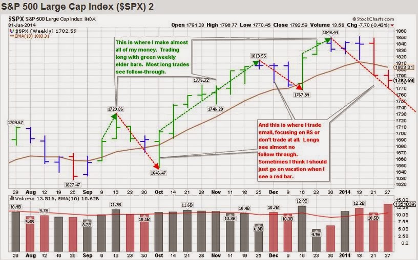
With apologies to Dr. Seuss, here's a chart which nicely summarizes my trade history:

I'm mainly a long trader, but I will occasionally take the right set-up in some of the triple short index ETFs.  However, that's still "long" a short fund.  It's just what seems to work for me right now.  2013 was really tough for shorts (at least for me vs. the indexes).  You had to be very quick in recognizing the turn, scale some profits, raise your stop and make sure you didn't give it all back when the indexes gapped up on Tuesday or Friday.  As the "Bill the Cat" cartoon likes to say, "ACk!".  I was lucky to scrape out a few pennies on more than one occasion last year.

Here's a short set-up that I'm watching in SCO:


Given my preference to trade on the long side, I tend to make most of money when the $SPX has green weekly elder bars and is trending up.  The trend might last 2 weeks or 10 weeks or more.  Sometimes I can squeeze another week of decent profits out at the top by focusing on relative strength in individual stocks while we trend sideways in the $SPX.  I need to get better at pressing harder during these periods - in any case, this is where I make my money.

On the flip side, when the $SPX is slipping down with blue or red elder bars - it's a struggle for me to trade on the long side.  Most of my long trades see no follow-through at all.  Therefore, I trade small or not at all.  For example, this week I saw some relative strength divergences in ETFs like:  IWO, IWC, IJH, MDY, XLF, FAS, TAN, and IBB - all of which failed to make a lower low on Wednesday and bounced sharply on Thursday.  You had to be quick in identifying that trade, taking profits, and raising stops or you gave back some profits on Friday.  My trades here are mainly short-term rentals which need lots of attention and quick fingers.  Another option is to take long set-ups in the double and triple short ETFs if I see low risk entries (like SCO above).


So, here's the question that I'm thinking about right now:  Is it worth it?

The way I see it, there's 4 options while the market is sliding downwards:
1.  Sit in cash and watch from the sidelines.  Kind of boring, but also a good time to reflect + spend more family time (which is also very valuable).
2.  Try to catch small bounces on the long side.  Reminds me of jumping in front of a bus to pick up a penny.
3.  Short a market that's basically crushed shorts since summer of 2011.  One of these times it's going to work, but that same logic can cause drawdowns.
4.  Some hybrid of the above.

Right now, I'm feeling like doing some hybrid of the 3 options.  I don't want to lose touch with the markets, but I also have no interest in losing the money that I make during uptrends.

So, that's my plan:  trade small, keep lots of cash, hang out with my daughter, and wait for the eventual turn and for green bars to come back!

For more charts (and less words), see my public chart list on stockcharts.com:
http://stockcharts.com/public/1109955